Blog

  • Web Design Books That Are Helping Me as a Beginner

    As someone learning web development, my greatest sense of satisfaction comes from my final website being functional, accessible, intuitive, and visually appealing. If any one of these elements are missing in my projects, my motivation starts to slip. That’s why I’ve made it my priority to learn design fundamentals alongside my current programming courses.

    In today’s blog post, I’ll be sharing some books that have helped me grasp design fundamentals. If you’re also a developer wanting to give your projects some extra flair—or you’re just curious about the world of web design—hopefully you’ll find something here that helps you too.

    1. Don’t Make Me Think, Revisited: A Common Sense Approach to Web Usability

    Don't Make Me Think book cover.

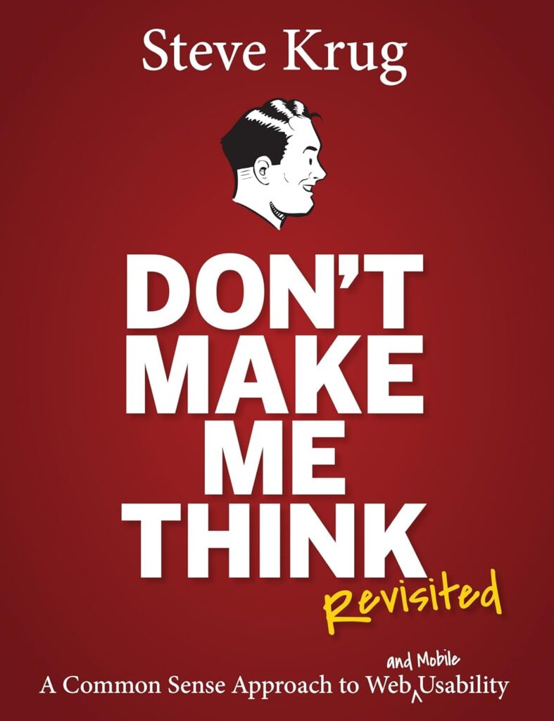
    Don’t Make Me Think by Steve Krug is a book that deconstructs UX/UI design in a way that’s clear, practical, and often pretty funny. I was a bit skeptical picking up this book at first when I saw that it was published over 10 years ago, but I can happily say all of Krug’s advice is still relevant.

    It’s been an eye-opening read so far, and I can see why it is so highly recommended.

    What you will learn from this book:

    • How people interact with the web.
    • When to follow design conventions and when to innovate.
    • How to guide users through your website.
    • Ways to write better content.
    • How to test your site’s effectiveness.
    • How to make a good first impression.
    • How to design UX/UI for mobile.
    • Why usability and accessibility is so important.

    2. Thinking with Type

    Thinking with Type book cover

    If you’re looking for an insightful and detailed book on typography—including its history, theory, and application—Thinking with Type by Ellen Lupton is the right choice for you.

    This book stood out to me because it explores how typography works across different cultures and languages, which is a valuable perspective to have if you want to create culturally conscious design, work fluidly with different languages, or want to draw inspiration from global traditions to add some innovation to your work.

    I’m still making my way through it, but it’s already given me a deeper appreciation for how intention and expressive type can be!

    What you will learn from this book:

    • How to use typography as a tool to convey a message or a feeling.
    • Letterform evolution and its importance.
    • How typefaces have different histories and cultural contexts.
    • Why spacing is important and how to utilise it.
    • The anatomy of typeface and how it impacts your piece.
    • The importance of grids.
    • How hierarchy works.
    • Considerations to make when working with digital media.

    3. Designing and Prototyping Interfaces with Figma

    Figma has been my preferred tool for prototyping web designs for a while now. The way the app displays measurements between elements, and how easy it is to create and follow a grid system, has been far more intuitive for me than any other program.That being said, I haven’t even scratched the surface of the app, and finding good tutorials hasn’t been easy for me.

    Most tutorials and resources tend to skip over the why behind certain workflows or use seemingly random plugins without any explanation. For this reason, I’m really glad I came across Designing and Prototyping Interfaces with Figma by Fabio Staiano. This book offers a structured and in-depth look at how to approach interface design with Figma, and it’s helped me fill in a lot of the gaps that online guides tend to gloss over.

    What you will learn from this book:

    • Learning or transitioning to Figma UI.
    • How to create moodboards, personas and user flows in Figjam.
    • How to wireframe with basic vector tools.
    • How to implement consistent grids, colours and typography.
    • How to create a responsive mobile design with the auto layout tool.
    • The features of Figma that allow it to be a collaborative workspace.
    • How to test your prototype in the browser and across different devices.
    • How to export your design assets for later use.
    • Which plugins and widgets to use.
    • Conditional prototyping and variables.

    4. Fixing Bad UX Designs

    Fixing Bad UX Designs by Lisandra Maioll is a book that teaches you how to test your website, interpret the results, and apply UX/UI principles to improve it.

    It’s easy to fall back on general design principles when building a website, but this book encourages you to pay attention to how people are actually interacting with it — and then adjust.

    If you’re looking for a book with A LOT of website analytical tools and testing methods, this one is a great pick.

    What you will learn from this book:

    • Why UX is important for the success of services and products, including its ROI, metrics and KPIs.
    • The role of stakeholder involvement in UX design.
    • How to identify UX issues through testing, tools and competitor analysis.
    • How to conduct user research and design user journeys
    • How to organise your research findings and improve conversion rates through UX analysis.
    • How to design better UI, content, and incorporate accessibility needs.
    • How UX is applied in physical environment.
    • How to improve IA for better navigability and findability.
    • How to test, validate and refine UX solutions, as well as measure their impact.
    • How to stay updated in the field of UX design.

    Final Thoughts

    While there are many web design books out there, these were the ones I felt were the most impactful for me as a beginner so far. Overall, I’m incredibly grateful to have access to such valuable resources, and I can’t wait to apply what I’ve learned to my future projects.

    If you’re just starting out in web design, I hope these books will be as helpful to you as they have been for me. But let me know—are there any books I’ve missed? Leave a comment below!

  • Aesthetics Over Accessibility: My Issue With the Web Revival Movement

    The web revival movement has always interested me—in fact, learning about it was what made me realise that I had an interest in web development in the first place. However, after starting a web development course in mid-2024, it’s since become apparent to me that web revival spaces tend to overlook the crucial elements of the modern web that allow for the web to be usable for all people. I’m writing this post today because I believe this can change. There are ways that web revivalists can add web accessibility into their websites without sacrificing their aesthetic preferences, which I’ll share with you at the end of this blog post.

    Screenshot of the Neocities search web page.
    Websites hosted on the Neocities website.

    What is the Web Revival Movement?

    The web revival movement is all about reducing your time on modern social media platforms and opting to spend time creating and interacting with your own personal website instead.

    Web revivalists typically make their websites through the lens of nostalgia, drawing inspiration from the early 2000s internet, where websites didn’t feature A.I. or complex algorithms that dictate everything you see.

    Web revival movement websites, or “indie websites,” are loved for their creative designs, vibrant colours, and animated GIFs, just like the old web. They are usually made with simple HTML and CSS and hosted on platforms like Neocities, which play their own role in promoting the movement.

    To learn more about why the web revival movement exists, you may want to look into the Dead Internet Theory.

    Exploring Web Revival Spaces

    Viewing indie websites—for the most part—has been a lot of fun for me. I love seeing the creativity and effort people have put into their websites. However, it doesn’t take long to find that most websites have glaring inaccessibility issues.

    Many websites I come across on the indie web use flashing GIFs in their design, which can be harmful for people with photosensitivity or epilepsy. Others add disclaimers like “not mobile-friendly,” completely excluding people who rely on their phones to navigate websites. I’ve also yet to find single website that uses properly structured, semantic HTML, creating issues for people who browse the web with the help of screen readers. These accessibility issues have quick solutions in today’s world, but still exist on most recently published indie websites.

    Now, saying this, I do not believe that people are intentionally making their websites inaccessible. Rather, people tend to view older tutorials to create older-looking websites. Since their goal isn’t to become professional web developers, it’s understandable that they haven’t delved into the differences between old web standards and current web standards. However, this lack of awareness is leading to design choices that are unintentionally excluding many users.

    Adding Accessibility to Indie Websites

    So, is it even possible to create accessible indie websites while staying true to the web revival movement? Yes!

    If you’re creating, or have created your own indie website, I definitely recommend reading the W3C Accessibility Guidelines and checking your website accessibility score with Google Lighthouse. However, here are a few things you can implement to keep your website accessible right now:

    • Structured and semantic HTML code.
    • Alt text added to image and video elements.
    • Accessible contrast and colour choices for people with vision impairments or colour blindness.
    • The removal, or reduced speed, of fast flashing GIFs or videos on your web page.
    • Consistent navigational elements.
    • Clear links and buttons.
    • The removal of auto-playing videos or sound.
    • Responsive design (yes, mobile-friendly).

    Final Thoughts

    To end this blog post, I want to say that while indie websites can sometimes miss the mark on accessibility, I still think that the web revival movement is great and important for many reasons. And regardless of how much we already know about accessibility standards, there’s always room for improvement, so let’s do our part by keeping everyone up to date, and pushing for a more inclusive, more inspiring internet.

    What do you think? Let me know your thoughts on balancing creativity and accessibility in web design by writing a comment down below.

  • Creating My First Portfolio: A Brief Reflection

    In 2024, I took my first steps into the world of web development, where I began a project that would become a defining moment in my learning journey: creating my first portfolio website. This project was only for part of my coursework, but it provided me with an opportunity to learn how to create a professional representation of my work—an invaluable skill for my future career. In this post, I’ll walk through my thought process behind my website, as well as what I would change now.

    The finished homepage to the portfolio website.

    Choosing the Overall Aesthetic

    As this was the very last project for the semester—and a personal project—I decided to research different CSS design elements, and incorporate the ones I liked into my design.

    At first, I had really wanted to try glass morphism and animated gradients, but the more I played around with these design elements in Figma, the more uncertain I became about their practicality. I struggled to create a design concept that not only met accessibility guidelines but also avoided negatively impacting page load times. This resulted in me narrowing down my design choices, and using a simple unanimated CSS gradient instead.

    I picked three colours I liked for the gradient and decided to use them as the main accents throughout the website. For the background and the call-to-action elements, I decided I would include my preference for dark theme applications—a design choice that also seemed to be a common trend among other developer portfolios that I had looked into.

    Snippet of the portfolio website's stylesheet
    Snippet of the stylesheet I created.

    My font choice was influenced by two YouTube videos I had watched: one about reviewing web development portfolios, and another discussing how to improve website performance through font selection. By using the system-ui font shown in these videos, I would increase my website’s loading times while maintaining a clean, non-distracting design for my viewers—who would likely be there only to glimpse at my credentials.

    Creating the layout of my website was fairly easy. I knew that people looking at my portfolio would want to find my credentials and contact details quickly and easily, so I focused on making the layout as minimal as possible. Each page contained only essential content, allowing users to move across the navigation bar quickly without excessive scrolling, ultimately leading them to my call-to-action. My “About Me” page did end up being more content heavy than the rest, so I made sure each section of that page remained partially visible beneath the current view, aiming to engage users and encourage them to scroll through the content.

    Challenges

    Most of the difficulties I had with this project can be attributed to my lack of experience with CSS. While I was not able to fix some of these issues, I believe they lead to creative solutions that will help me down the line.

    One issue I faced was figuring out how to round the corners of my project images. After a few attempts, I decided to leave them as squares. Although I couldn’t solve this issue, I think giving the projects a different shape helped them stand out more in comparison to the other content on the page.

    I also had difficulty ensuring that the height of my text sections was consistent across all boxes. To counteract this, I would keep rewriting my content until it looked the same size as the other boxes. Although time-consuming, this solution showed me how small changes can significantly impact the layout of a webpage.

    My largest issue was definitely with the grid. Some of my Flexbox content would space out randomly across the page if I had too much grid space assigned to a section, while some of my other content would ‘leak’ down into different sections. This took a long time to clean up, and some of the spacing between sections is still uneven, despite copying the exact measurements over. However, as it stands now, it is still a major improvement from the initial layout.

    What I Would Change

    Looking at how this project turned out, there are a few aspects I would approach differently now. However, I am still happy with this website as a first attempt.

    I believe some elements, such as the logo not being an SVG, and the whitespace being inconsistent in some areas, make my website look less professional. In the future, I would definitely put more effort into planning my CSS Grid and Flexbox usage from the start. Additionally, I would invest more time in creating a custom logo, just to give my website a more polished feel.

    Another area for improvement is the mobile layout version of my website. I believe that there could have been more thought and changes made to the top content sections of my mobile design, as they take up a lot of space and have an awkward amount of sideways scrolling. Furthermore, the navigation bar for mobile should have been converted into a hamburger menu to prevent users from tapping on the wrong navigation link. By improving this, I think the user experience for mobile users would be drastically improved.

    Final Thoughts

    Creating my portfolio has been both a challenging and rewarding experience. It’s helped me learn new skills, develop creative solutions, and think critically about web design. I believe this project has given me a solid foundation to build on, and I’m excited to apply the lessons I’ve learned to future projects—and, of course, a new and improved portfolio.