Category: Beginner Web Development

  • Aesthetics Over Accessibility: My Issue With the Web Revival Movement

    The web revival movement has always interested me—in fact, learning about it was what made me realise that I had an interest in web development in the first place. However, after starting a web development course in mid-2024, it’s since become apparent to me that web revival spaces tend to overlook the crucial elements of the modern web that allow for the web to be usable for all people. I’m writing this post today because I believe this can change. There are ways that web revivalists can add web accessibility into their websites without sacrificing their aesthetic preferences, which I’ll share with you at the end of this blog post.

    Screenshot of the Neocities search web page.
    Websites hosted on the Neocities website.

    What is the Web Revival Movement?

    The web revival movement is all about reducing your time on modern social media platforms and opting to spend time creating and interacting with your own personal website instead.

    Web revivalists typically make their websites through the lens of nostalgia, drawing inspiration from the early 2000s internet, where websites didn’t feature A.I. or complex algorithms that dictate everything you see.

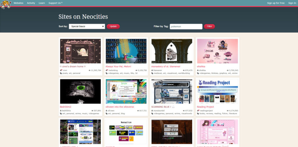
    Web revival movement websites, or “indie websites,” are loved for their creative designs, vibrant colours, and animated GIFs, just like the old web. They are usually made with simple HTML and CSS and hosted on platforms like Neocities, which play their own role in promoting the movement.

    To learn more about why the web revival movement exists, you may want to look into the Dead Internet Theory.

    Exploring Web Revival Spaces

    Viewing indie websites—for the most part—has been a lot of fun for me. I love seeing the creativity and effort people have put into their websites. However, it doesn’t take long to find that most websites have glaring inaccessibility issues.

    Many websites I come across on the indie web use flashing GIFs in their design, which can be harmful for people with photosensitivity or epilepsy. Others add disclaimers like “not mobile-friendly,” completely excluding people who rely on their phones to navigate websites. I’ve also yet to find single website that uses properly structured, semantic HTML, creating issues for people who browse the web with the help of screen readers. These accessibility issues have quick solutions in today’s world, but still exist on most recently published indie websites.

    Now, saying this, I do not believe that people are intentionally making their websites inaccessible. Rather, people tend to view older tutorials to create older-looking websites. Since their goal isn’t to become professional web developers, it’s understandable that they haven’t delved into the differences between old web standards and current web standards. However, this lack of awareness is leading to design choices that are unintentionally excluding many users.

    Adding Accessibility to Indie Websites

    So, is it even possible to create accessible indie websites while staying true to the web revival movement? Yes!

    If you’re creating, or have created your own indie website, I definitely recommend reading the W3C Accessibility Guidelines and checking your website accessibility score with Google Lighthouse. However, here are a few things you can implement to keep your website accessible right now:

    • Structured and semantic HTML code.
    • Alt text added to image and video elements.
    • Accessible contrast and colour choices for people with vision impairments or colour blindness.
    • The removal, or reduced speed, of fast flashing GIFs or videos on your web page.
    • Consistent navigational elements.
    • Clear links and buttons.
    • The removal of auto-playing videos or sound.
    • Responsive design (yes, mobile-friendly).

    Final Thoughts

    To end this blog post, I want to say that while indie websites can sometimes miss the mark on accessibility, I still think that the web revival movement is great and important for many reasons. And regardless of how much we already know about accessibility standards, there’s always room for improvement, so let’s do our part by keeping everyone up to date, and pushing for a more inclusive, more inspiring internet.

    What do you think? Let me know your thoughts on balancing creativity and accessibility in web design by writing a comment down below.

  • Creating My First Portfolio: A Brief Reflection

    In 2024, I took my first steps into the world of web development, where I began a project that would become a defining moment in my learning journey: creating my first portfolio website. This project was only for part of my coursework, but it provided me with an opportunity to learn how to create a professional representation of my work—an invaluable skill for my future career. In this post, I’ll walk through my thought process behind my website, as well as what I would change now.

    The finished homepage to the portfolio website.

    Choosing the Overall Aesthetic

    As this was the very last project for the semester—and a personal project—I decided to research different CSS design elements, and incorporate the ones I liked into my design.

    At first, I had really wanted to try glass morphism and animated gradients, but the more I played around with these design elements in Figma, the more uncertain I became about their practicality. I struggled to create a design concept that not only met accessibility guidelines but also avoided negatively impacting page load times. This resulted in me narrowing down my design choices, and using a simple unanimated CSS gradient instead.

    I picked three colours I liked for the gradient and decided to use them as the main accents throughout the website. For the background and the call-to-action elements, I decided I would include my preference for dark theme applications—a design choice that also seemed to be a common trend among other developer portfolios that I had looked into.

    Snippet of the portfolio website's stylesheet
    Snippet of the stylesheet I created.

    My font choice was influenced by two YouTube videos I had watched: one about reviewing web development portfolios, and another discussing how to improve website performance through font selection. By using the system-ui font shown in these videos, I would increase my website’s loading times while maintaining a clean, non-distracting design for my viewers—who would likely be there only to glimpse at my credentials.

    Creating the layout of my website was fairly easy. I knew that people looking at my portfolio would want to find my credentials and contact details quickly and easily, so I focused on making the layout as minimal as possible. Each page contained only essential content, allowing users to move across the navigation bar quickly without excessive scrolling, ultimately leading them to my call-to-action. My “About Me” page did end up being more content heavy than the rest, so I made sure each section of that page remained partially visible beneath the current view, aiming to engage users and encourage them to scroll through the content.

    Challenges

    Most of the difficulties I had with this project can be attributed to my lack of experience with CSS. While I was not able to fix some of these issues, I believe they lead to creative solutions that will help me down the line.

    One issue I faced was figuring out how to round the corners of my project images. After a few attempts, I decided to leave them as squares. Although I couldn’t solve this issue, I think giving the projects a different shape helped them stand out more in comparison to the other content on the page.

    I also had difficulty ensuring that the height of my text sections was consistent across all boxes. To counteract this, I would keep rewriting my content until it looked the same size as the other boxes. Although time-consuming, this solution showed me how small changes can significantly impact the layout of a webpage.

    My largest issue was definitely with the grid. Some of my Flexbox content would space out randomly across the page if I had too much grid space assigned to a section, while some of my other content would ‘leak’ down into different sections. This took a long time to clean up, and some of the spacing between sections is still uneven, despite copying the exact measurements over. However, as it stands now, it is still a major improvement from the initial layout.

    What I Would Change

    Looking at how this project turned out, there are a few aspects I would approach differently now. However, I am still happy with this website as a first attempt.

    I believe some elements, such as the logo not being an SVG, and the whitespace being inconsistent in some areas, make my website look less professional. In the future, I would definitely put more effort into planning my CSS Grid and Flexbox usage from the start. Additionally, I would invest more time in creating a custom logo, just to give my website a more polished feel.

    Another area for improvement is the mobile layout version of my website. I believe that there could have been more thought and changes made to the top content sections of my mobile design, as they take up a lot of space and have an awkward amount of sideways scrolling. Furthermore, the navigation bar for mobile should have been converted into a hamburger menu to prevent users from tapping on the wrong navigation link. By improving this, I think the user experience for mobile users would be drastically improved.

    Final Thoughts

    Creating my portfolio has been both a challenging and rewarding experience. It’s helped me learn new skills, develop creative solutions, and think critically about web design. I believe this project has given me a solid foundation to build on, and I’m excited to apply the lessons I’ve learned to future projects—and, of course, a new and improved portfolio.