In 2024, I took my first steps into the world of web development, where I began a project that would become a defining moment in my learning journey: creating my first portfolio website. This project was only for part of my coursework, but it provided me with an opportunity to learn how to create a professional representation of my work—an invaluable skill for my future career. In this post, I’ll walk through my thought process behind my website, as well as what I would change now.
Choosing the Overall Aesthetic
As this was the very last project for the semester—and a personal project—I decided to research different CSS design elements, and incorporate the ones I liked into my design.
At first, I had really wanted to try glass morphism and animated gradients, but the more I played around with these design elements in Figma, the more uncertain I became about their practicality. I struggled to create a design concept that not only met accessibility guidelines but also avoided negatively impacting page load times. This resulted in me narrowing down my design choices, and using a simple unanimated CSS gradient instead.
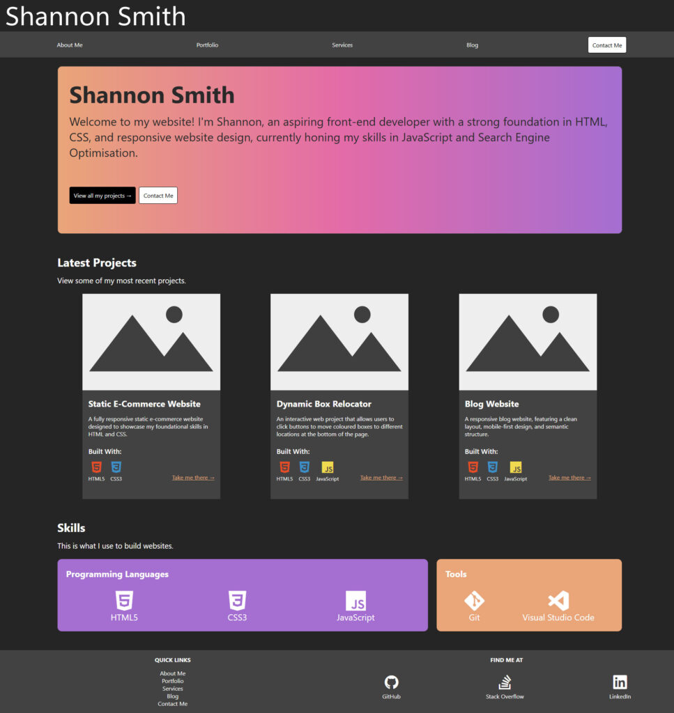
I picked three colours I liked for the gradient and decided to use them as the main accents throughout the website. For the background and the call-to-action elements, I decided I would include my preference for dark theme applications—a design choice that also seemed to be a common trend among other developer portfolios that I had looked into.
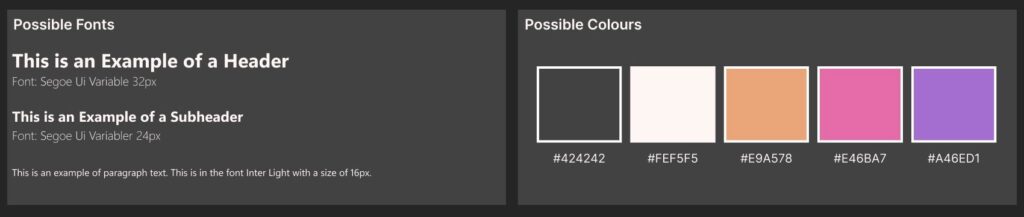
My font choice was influenced by two YouTube videos I had watched: one about reviewing web development portfolios, and another discussing how to improve website performance through font selection. By using the system-ui font shown in these videos, I would increase my website’s loading times while maintaining a clean, non-distracting design for my viewers—who would likely be there only to glimpse at my credentials.
Creating the layout of my website was fairly easy. I knew that people looking at my portfolio would want to find my credentials and contact details quickly and easily, so I focused on making the layout as minimal as possible. Each page contained only essential content, allowing users to move across the navigation bar quickly without excessive scrolling, ultimately leading them to my call-to-action. My “About Me” page did end up being more content heavy than the rest, so I made sure each section of that page remained partially visible beneath the current view, aiming to engage users and encourage them to scroll through the content.
Challenges
Most of the difficulties I had with this project can be attributed to my lack of experience with CSS. While I was not able to fix some of these issues, I believe they lead to creative solutions that will help me down the line.
One issue I faced was figuring out how to round the corners of my project images. After a few attempts, I decided to leave them as squares. Although I couldn’t solve this issue, I think giving the projects a different shape helped them stand out more in comparison to the other content on the page.
I also had difficulty ensuring that the height of my text sections was consistent across all boxes. To counteract this, I would keep rewriting my content until it looked the same size as the other boxes. Although time-consuming, this solution showed me how small changes can significantly impact the layout of a webpage.
My largest issue was definitely with the grid. Some of my Flexbox content would space out randomly across the page if I had too much grid space assigned to a section, while some of my other content would ‘leak’ down into different sections. This took a long time to clean up, and some of the spacing between sections is still uneven, despite copying the exact measurements over. However, as it stands now, it is still a major improvement from the initial layout.
What I Would Change
Looking at how this project turned out, there are a few aspects I would approach differently now. However, I am still happy with this website as a first attempt.
I believe some elements, such as the logo not being an SVG, and the whitespace being inconsistent in some areas, make my website look less professional. In the future, I would definitely put more effort into planning my CSS Grid and Flexbox usage from the start. Additionally, I would invest more time in creating a custom logo, just to give my website a more polished feel.
Another area for improvement is the mobile layout version of my website. I believe that there could have been more thought and changes made to the top content sections of my mobile design, as they take up a lot of space and have an awkward amount of sideways scrolling. Furthermore, the navigation bar for mobile should have been converted into a hamburger menu to prevent users from tapping on the wrong navigation link. By improving this, I think the user experience for mobile users would be drastically improved.
Final Thoughts
Creating my portfolio has been both a challenging and rewarding experience. It’s helped me learn new skills, develop creative solutions, and think critically about web design. I believe this project has given me a solid foundation to build on, and I’m excited to apply the lessons I’ve learned to future projects—and, of course, a new and improved portfolio.